This whole project relied on the ability to interact effectively with media technology effectively, individually and as a group. The different media technologies are extensive:
- www.blogger.com
- www.youtube.com
- Adobe Photoshop
- Final Cut Pro
- Video recording cameras
- Photo cameras
- Screen grab
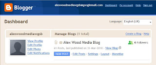
This was the screen which greeted me every time I logged on to Blogger. I grew accustomed to using the different buttons to do exactly what they said. I also learned to use the post writing page very quickly, as it was just like a word processor in the way it worked. The only difference was using labels on each post, which was done simply by writing them in the box provided like so:

other than that this section of the work was relatively simple. The next website I
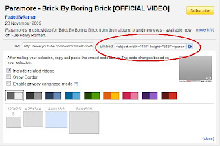 felt the need to become familiar was www.youtube.com because it would become very useful for my research at the beggining of the project. In coupling with this, I learned how to embed the videos from YouTube onto my blogs. This was done by pasting the "Embed Code" from YouTube onto the "Edit Html" section of the website.
This allowed me to present all the videos which I
used in my research, and was far better aesthetically than just providing a link. All that was required was copying and pasting one simple code and the video was viewable.
After researc
 hing the videos I decided to make the mood board as a source of inspiration. Here I used simple screen captures of shots from the paused videos, again from YouTube. But to make the mood board itself I used the Adobe Photoshop programme. I simply used a different layer for each shot, this allowed me to overlay them slightly, filling up the page in a stylish manner. I used this exact same method when making the mood board for the album covers.
We also used this programme whilst making the ancillary tasks. Personally for the magazine advert I found it particularly useful. To start with, I
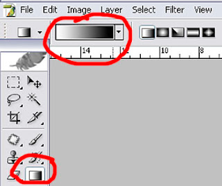 used the gradient tool (pictured) to create a simple gradient and changed to colours to red and black, the colours of our theme. I then imported the image of the album cover Tom had already used, because I knew that this would need to be featured on the advert. I experimented with it in several places before deciding the middle was best. Next I chose the first font and placed the font, including all the essential information needed from an advert (Release date, title, artist, record label). I then imported some more images of logos of the various corporations and labels involved with the album and arranged them along the bottom, as this seemed to be their most ideal location. After this, the text needed to be modified to look for professional. To do this I used the blending options to add drop shadows, interior/exterior glows and bevels.
The next, and perhaps most important media technology needed in the project was the Final Cut programme. It was on this that we made the video itself, and it was also the most difficult programme to use in my opinion. It was
 a programme I had never used before personally but after alot of practice I finally got the hang of it. The part I found most confusing was the different tracks, but in the end I got the hang of it. It eventually turned out to be alot more useful. Spreading the clips ov
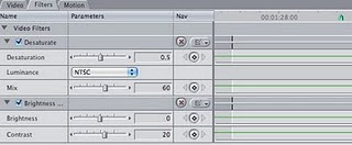 er two seperate tracks made it alot less confusing and fiddly. If we had kept it on the same track, we would have had to change the timing on each individual clip, but instead we were able to overlay them instead. It was also through this programme that we were able to add extras such as effects and transitions to the video. The fades at the end of the video were a result of this, as was the tint and contrast changes over the whole video.
It wasn't only software that we used over the course of the project, indeed one of the most important components was the hardware we used; cameras. The whole video was shot using a standard handheld video camcorder. It had basic features and functions such as zoom and cut points. We recorded everything onto video tapes, and then uploaded them from the cameras into Final Cut, via a Firewire.
Personally I feel that our use of media technologies was a massive success. However, given the chance to change anything, I would have used more than one camera during filming. It would have allowed to get a wider selection of shots and would have increased efficiency. For example this time round there would always have been on or two members of the group standing idle while somebody filmed. If we all had cameras, we would have used our time more efficiently.


 owed. A prime example of this is the change at the very end of the song, from very swift cuts during the final build up, to cross fades when the music slowed. This allowed us to slow the editing and therefore follow the pace of the music more effectively. The picture to the left shows the fade between two shots at the end of the video. To achieve this fade we added it as a simple transition between the two clips.


